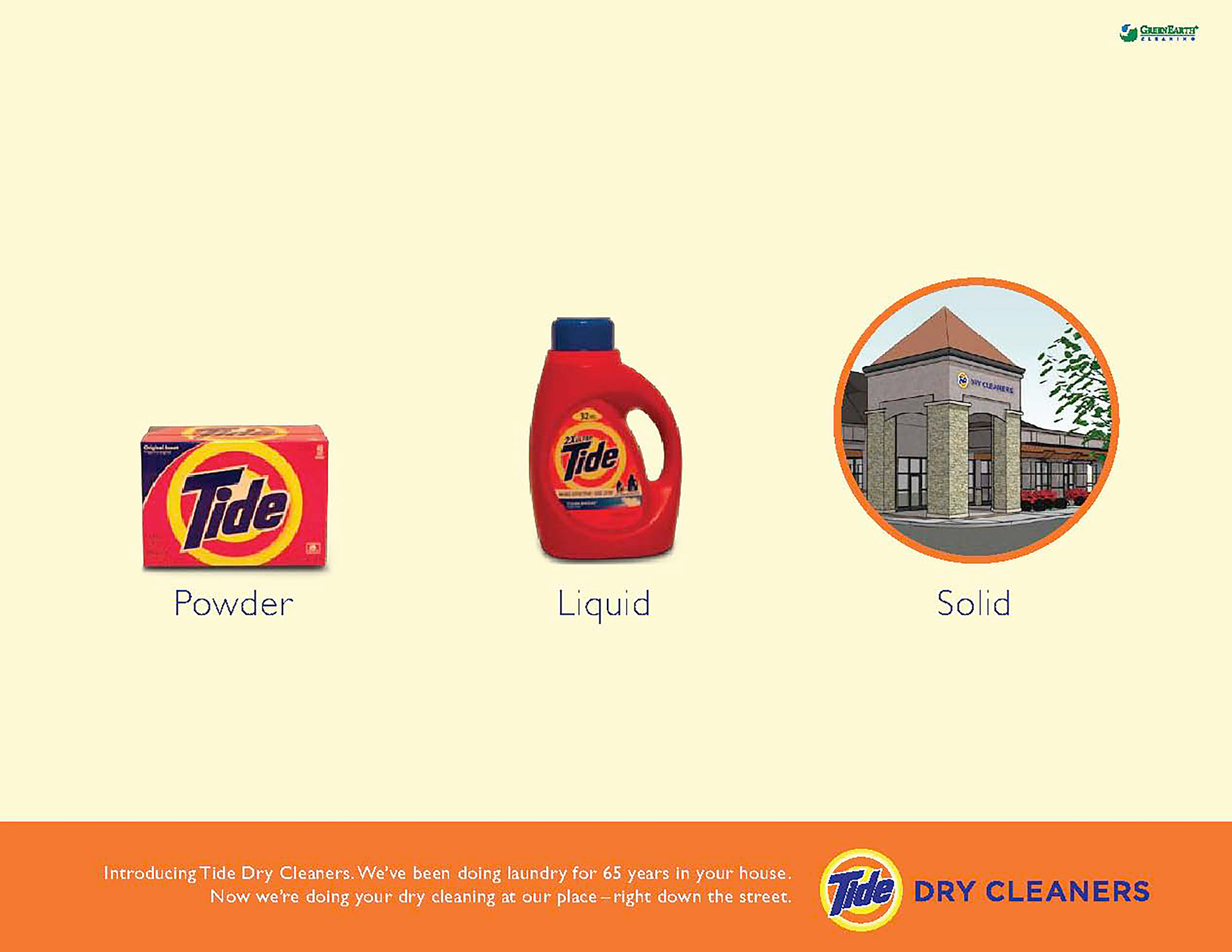
Tide, a P&G brand, was considering opening brick and mortar dry cleaning stores, so I was tasked with coming up with ideas for their launch campaign. These would be converted to banners ads and to a microsite. I played off what people already knew about Tide and made the simple next step for Tide to be a dry cleaners. Simple, visual and fun. (Design: Lauren Anderson)

____________________________________________
SEALY B2B HOTEL TRADE ADS
I created these ads as part of work for Sealy's rebranding of their business-to-business hotel trade marketing. We highlighted 3 features that were important to hotels in terms of lasting longer with titanium springs to ease of housekeeping with no slip pads and heavy duty handles. To make a hipper brand tone and personality, my concept played off of the fortune cookie phrase people say after they read the fortune ("in bed") and used the actual bed image instead of the words "in bed." (Design: Tomas Gardner)
I created these ads as part of work for Sealy's rebranding of their business-to-business hotel trade marketing. We highlighted 3 features that were important to hotels in terms of lasting longer with titanium springs to ease of housekeeping with no slip pads and heavy duty handles. To make a hipper brand tone and personality, my concept played off of the fortune cookie phrase people say after they read the fortune ("in bed") and used the actual bed image instead of the words "in bed." (Design: Tomas Gardner)
___________________________________________________
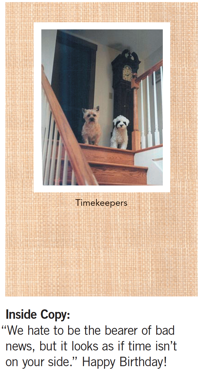
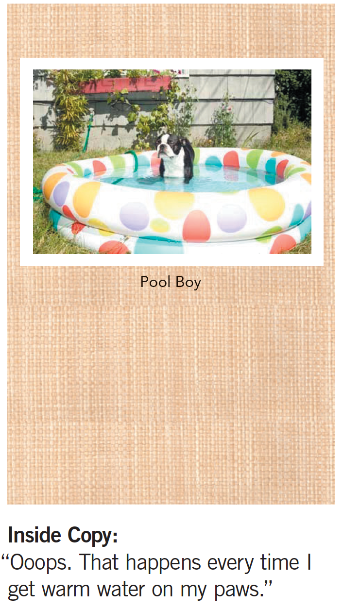
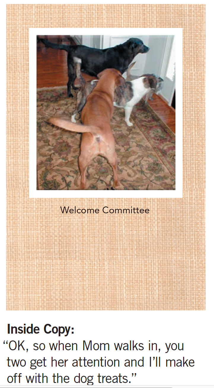
Greenies dog and cat dental treats was looking for a branded campaign for their three top products. Below is one take on a more emotionally driven campaign. It played up the true relationship people have with their furbabies. The point made was that your pet isn't just any pet so don't give them just any treat. Design; Martin Buchanan)
Part of the pitch to Greenies was to offer free greeting cards with limited-time packages of Greenies Treats. People love cards featuring pets and so this was a perfect marketing hack idea to get more eyeballs on the brand in a non-selling way. The back of the cards were branded with Greenies Greetings.

_____________________________________________________
Sea Ray, a luxury brand, was looking to refresh their brand. Their boats had amazing features that were made for great experiences on the water. We highlighted those in these ads under the tagline of "A 1000 little things that make a perfect day" in way that captured what boaters love about being on the water. Like a deep hull for a smooth ride or Quiet Ride technology for reduced engine noise. (Design: Martin Buchanan)
__________________________________________________
HondaJet was slow to the Very Light Jet market and my experience branding and launching the very first VLJ proved handy. I understood what pilots cared about. These ads focused on those as long tail descriptive URLS and beauty shots of the jet. That's it. All to introduce, titillate and drive people to landing pages that paid off the URL theme with the techs and specs pilots would want. And the jet is a very beautiful and interesting design, so the idea was spot on. (Design: Ron Irons)
___________________________________________________
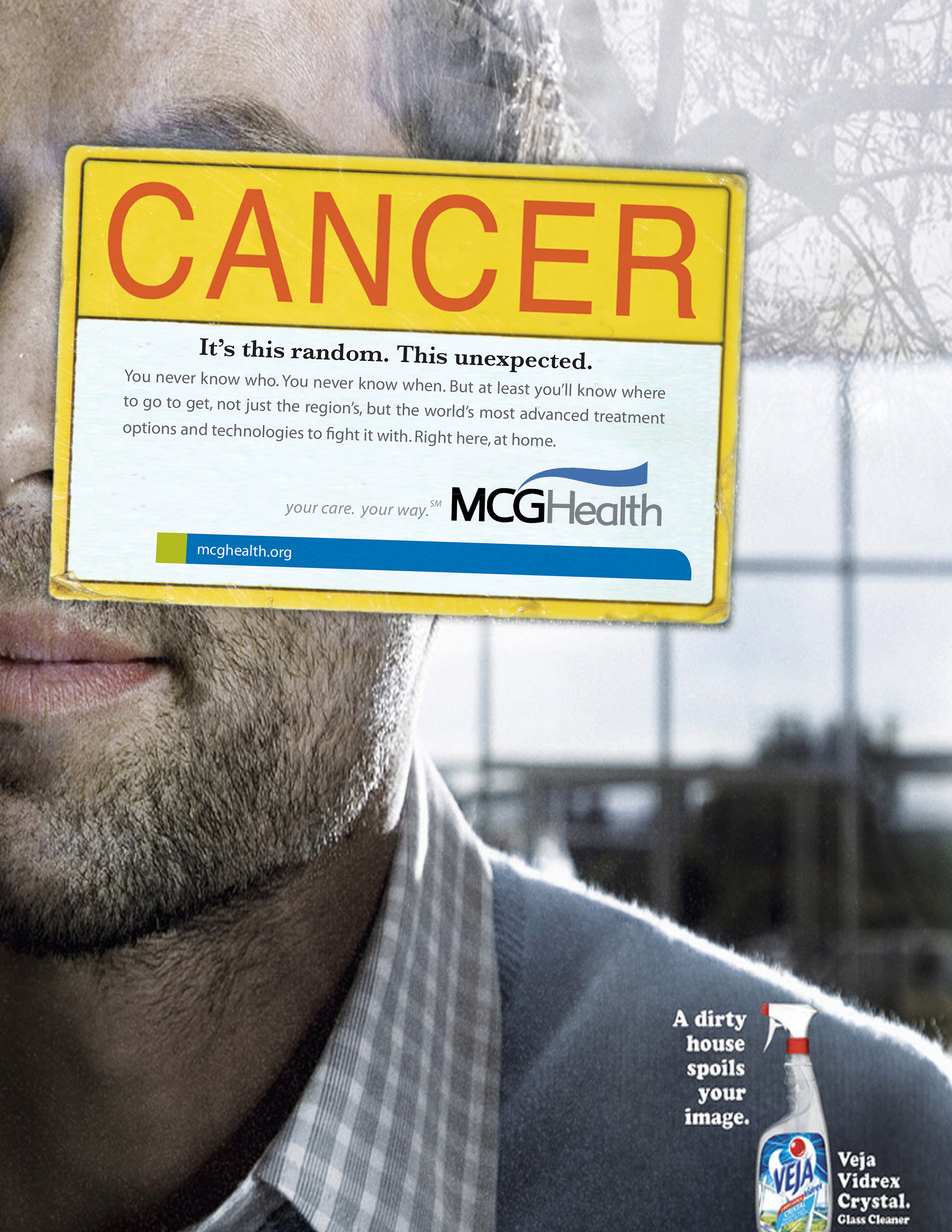
MCG Health had an amazing Cancer Center that needed to get the word out. I came up with these magazine inserts that looked like regular print ads (Note the fake brands). The twist was, we applied a real label to each ad for a 3-D feel and eye-stopping visual approach.
The point: cancer can come out of nowhere, but at least you can take comfort in knowing MCGHealth would be there if cancer ever did touch your life. (Design: Tomas Gardner)
The point: cancer can come out of nowhere, but at least you can take comfort in knowing MCGHealth would be there if cancer ever did touch your life. (Design: Tomas Gardner)

____________________________________________________
How do you create florist ads that jump out at you? Use old Audubon-like prints but change out what the Latin name is to now be the reason to buy flowers. (Design credit: Tomas Gardner)