inKind was a platform that let donors know where their money was going and helped them feel truly connected to the cause by allowing them to buy items directly needed for projects.
They could read project stories, buy an item needed by the project through our platform directly through Home Depot (for instance a box of nails for a Habitat for Humanity home) and have 100% transparency.
The nonprofit could then reconnect with the donors by sending them photos of the final project. Donors got to SEE the nails in the roof. They knew they had made an impact. AND THAT WAS BUILDING DEEPER RELATIONSHIPS, FEEL-GOOD MOMENTS and EASY WAYS TO GIVE BACK. Revolutionary.
I concepted and directed our logo with help from Art Director Martin Buchanan. We created our own typeface for a completely ownable look. And chose bright colors for the positive, upbeat feeling we wanted to convey to donors and nonprofits.
A video explainer done for no cost to initially rollout inKind to nonprofits.
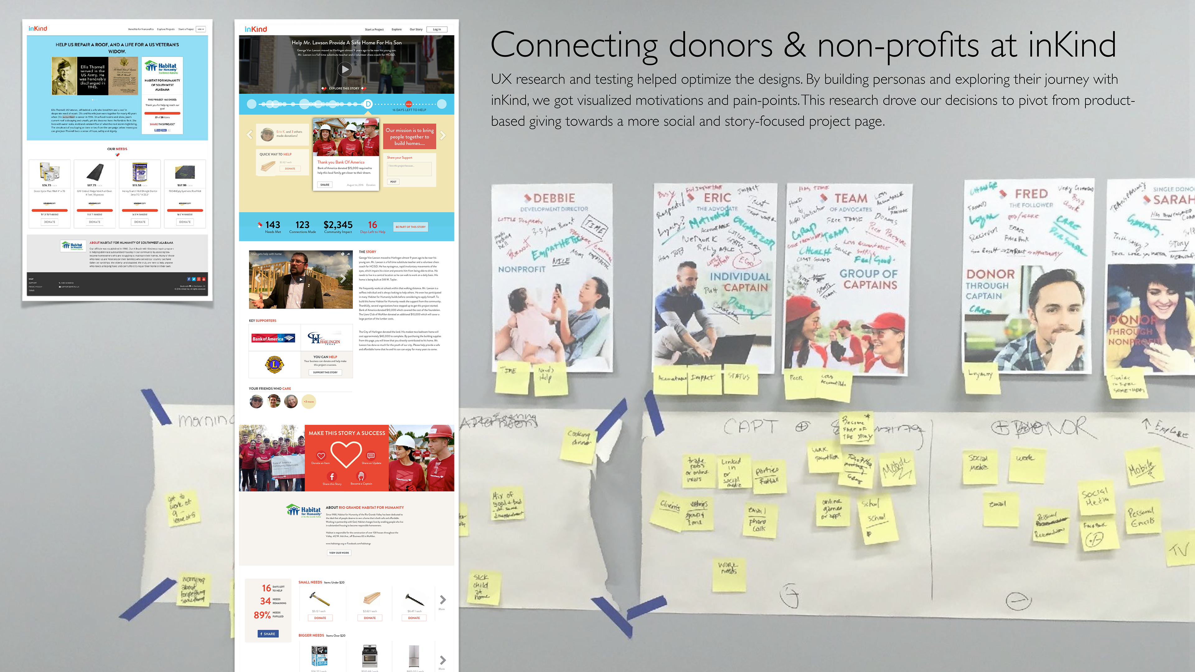
As we got momentum, we refreshed our brand and website. Our platform was fundamentally about building stories to create deeper relationships with donors. I named this STORYBUILDING versus storytelling because we were working with donors to help "build" the stories of need through every item donated. A story wasn't a story without each person's donation, thus building the story with the nonprofit and inKind.
Initially we had nonprofits build campaign pages asking for the items they needed to complete their projects.
Phase 2 was to do our deeper dive research on our personas and our UX. This led us to iterate to a more social, story-focused project/campaign page.

The new experience was launched!
People could browse projects/stories based on location or by the story that spoke to them the most.
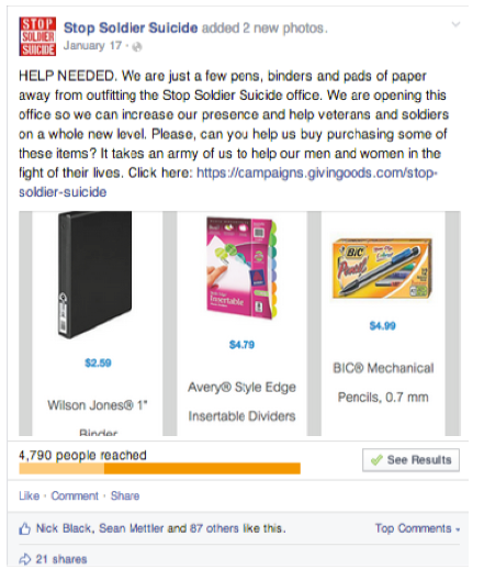
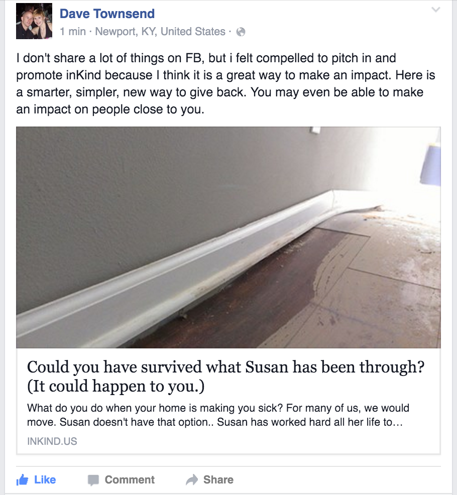
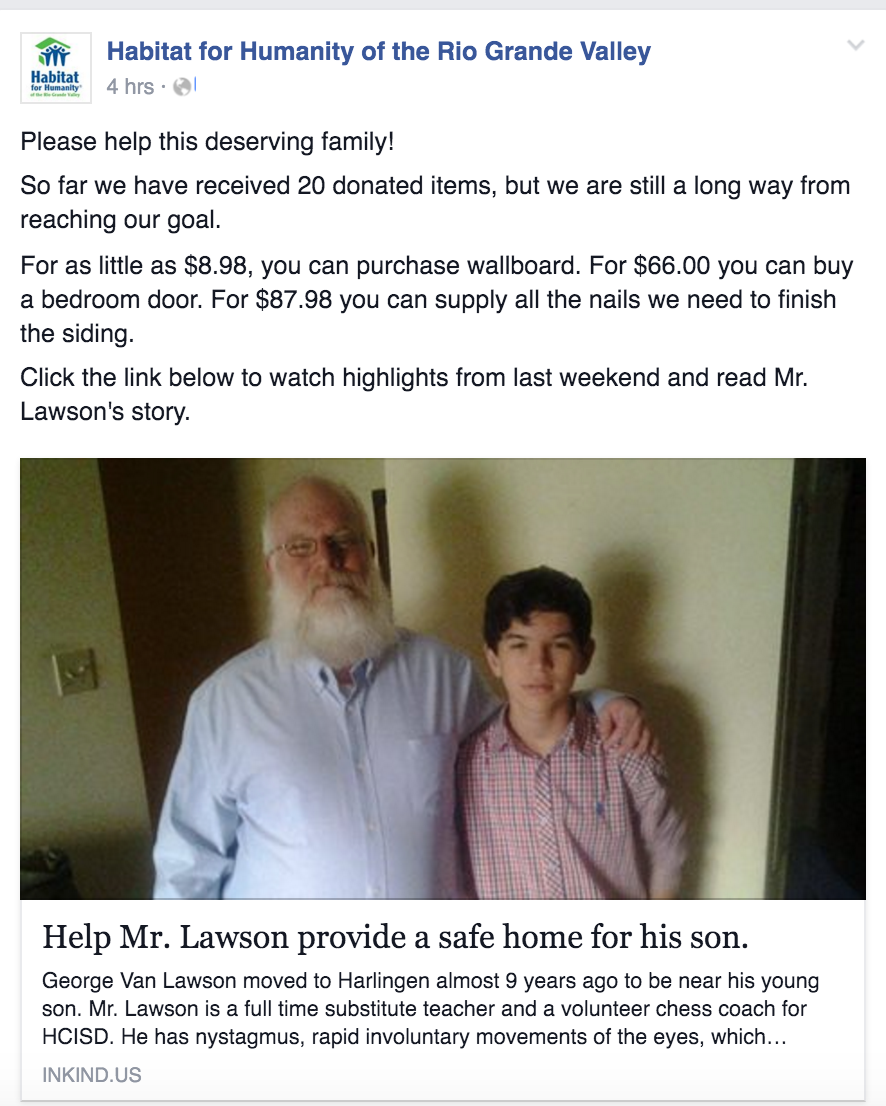
From a social media perspective it was a huge hit. Supporters loved it, shared it, and nonprofits had posts that mattered. Stop Soldier Suicide alone got items needed totaling more than $10,000 to open their office.


AND ALL GOOD THINGS MUST END. We didn't have the resources or time to fix the tech bugs we encountered with inventory issues and price changes through Home Depot.
WE PIVOTED before we ran out of investor money. If it was all about building relationships with donors, what if we asked donors what they care about? What if we curated content and helped nonprofits stay connected based on the things donors were interested in? GOODUNITED was born. Supporters got to create THEIR newsfeed page based on what they cared about. We started with Military Veteran nonprofits.
WE PIVOTED before we ran out of investor money. If it was all about building relationships with donors, what if we asked donors what they care about? What if we curated content and helped nonprofits stay connected based on the things donors were interested in? GOODUNITED was born. Supporters got to create THEIR newsfeed page based on what they cared about. We started with Military Veteran nonprofits.
I named the platform, directed the logo and web design and wrote the content. We were off and running. And our vision was still intact.
A supporter could choose the content they cared about and then only receive that from the nonprofits.
supporters could go to their newsfeed page and read stories GoodUnited had curated for them. Nonprofits could also add their own stories and if a supporter had chosen to receive those stories, they'd appear in the newsfeed too.
Nonprofits could see their supporters and the topics each supporter had chosen. There was a lot of insightful metrics and data we were able to supply the nonprofit with. We took the guesswork out of what donors wanted.
Supporters got a weekly "digest" email with story snippets they could click on to read more, which the took them to the site and their newsfeed page. On that page they could donate if they choose via a sidebar button. (Interestingly we found that pictures in a digest email did not increase click rates.)