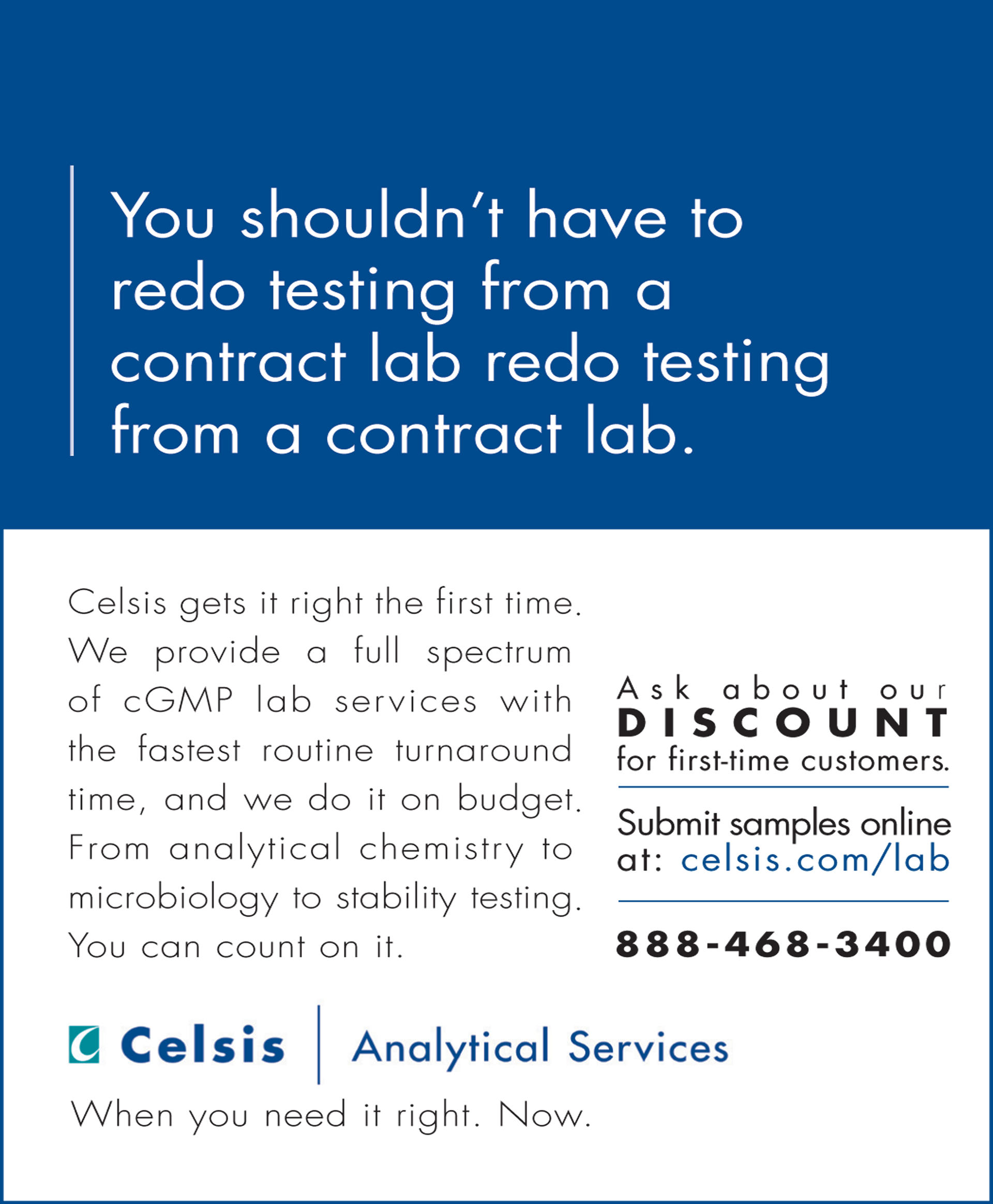
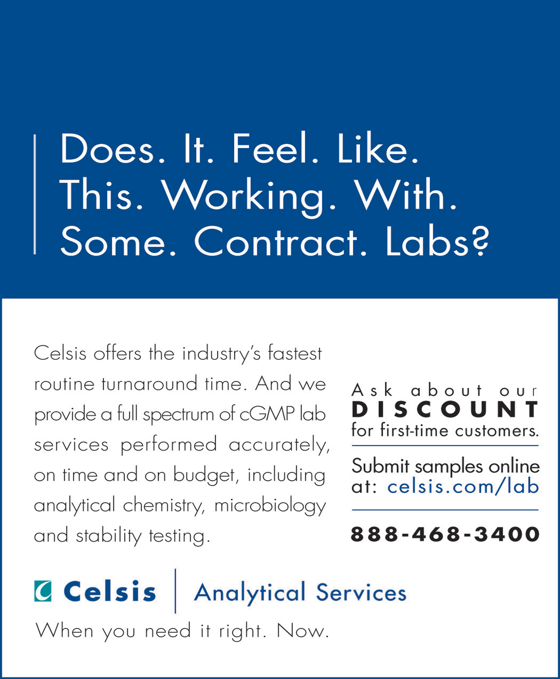
No one in the IVT category was doing digital and most of the pubs couldn't take an animated gif—until we nudged them. These banners had color, a fun attitude that stood out, and helped create a personality for the brand. They drove to a landing page that paid off the offers.
The Analytical Services/Lab Testing division was faster and more accurate than competitor labs. We got attention with our banners that showed we understood the frustrations of the industry.
Print ads supported banners.


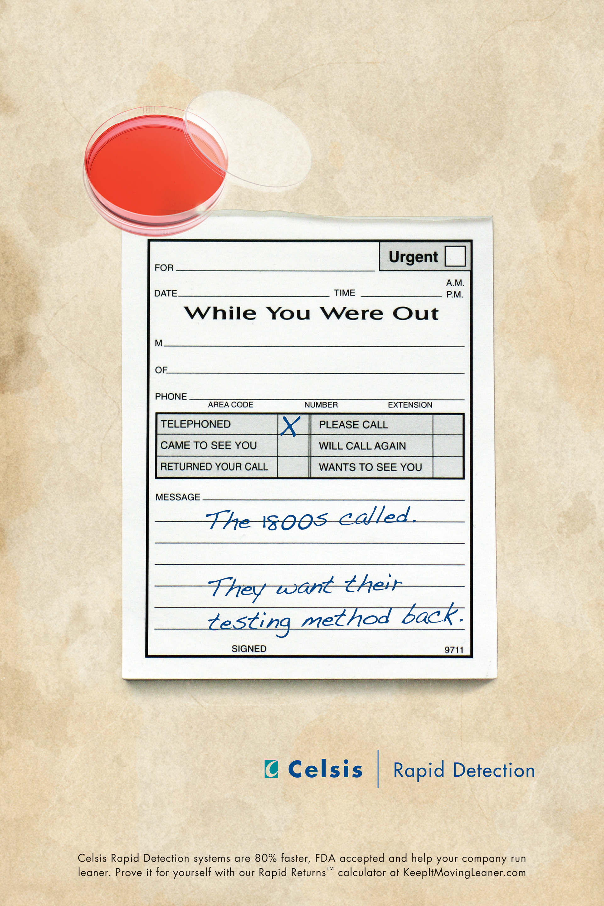
In the Rapid Detection division, we created fun posters sent as direct mail. Potential clients loved them AND current clients requested them. They poked fun at the 100-year-old method companies still used to test for contamination in their products while Celsis Rapid Detection was faster, more accurate and better overall.


We rolled out simple color-branded ads in trade pubs, created matching banner ads that drove to a landing page we called KEEP IT MOVING LEANER. The page had a calculator feature that let people see their savings using Celsis Rapid Micro. (Banners were SWFs and can't be converted to show here.)
Ads, banners and direct mail all drove to this landing page. We tracked clicks, number of unique users of the calculator, which required an email address to get results, and white paper downloads. They all went into the CRM funnel for email response. We had a "tree" for our email campaign that showed us who responded to offers and what type of offers moved them.
We even created a "fake" cover for Industry Week magazine that targeted pharmaceutical lab manager subscribers. From the snippets of what was "inside" to the design and overall magazine headline, we spoke to the target's concerns. Inside the cover was our own article and our ad on the back coverSubscribers who were in our pharmaceutical target niche were the only ones who got this version of the magazine.
The inside cover was our Thought Leader article from Celsis' CEO.
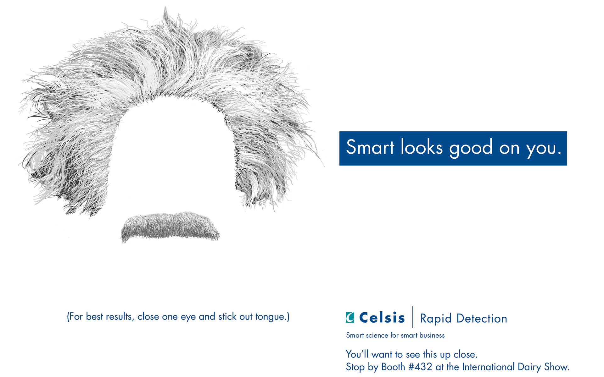
For the Rapid Micro Dairy division (A subset of Rapid Micro) I worked on a new campaign centered around a trade show that was crucial for sales. We started with a tagline: Smart looks god on you. (Which was a variation of the overall Celsis tagline of Smart science for smart business)
We did an App that you could use if you came by the booth called Einstein Me, we put mirror clings in the bathrooms that you could see your reflection with Einstein hair and mustache and we used the Einstein look on banners and booth graphics using a cow we called Cowstein. This campaign won top honors in the national Business Marketing Awards (BMA).
Trade show Banner up.

Einstein Me App created especially for the trade show. People could come to booth, use our iPad and Einstein themselves. We'd send their picture to them vial email, thus capturing email addresses. Those people then were given access to download the App on their phone/ipad. We also gave away an iPad at the booth.
This mirror cling invited people to see how they looked "Einstein Smart."
